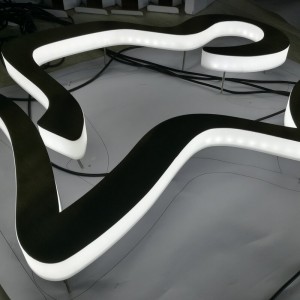

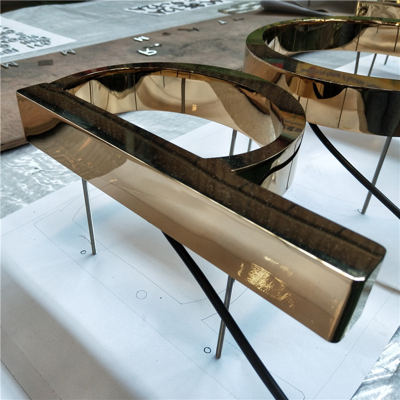


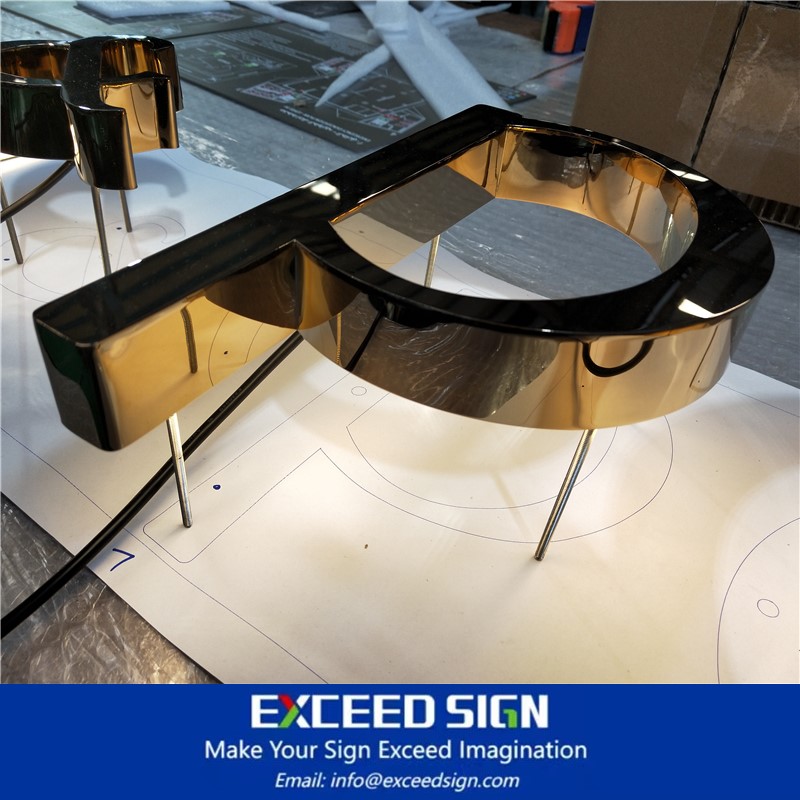
Reverse Channel Letter Fabrication Backlit Halo Lit Metal Illuminated Signs 3d Lighting Letter Exceed Sign
| Type | Backlit Sign |
| Application | Exterior/Interior Sign |
| Base Material | Stainlees Steel, Acrylic |
| Finish | Electroplated |
| Mounting | Rod |
| Packing | Wooden Crates |
| Production Time | 1 weeks |
| Shipping | DHL/UPS express |
| Warranty | 3 years |
Sign planning and design must emphasize the sense of order, whether at the top or the bottom, you can see the content of the logo, and many scenic spots in the creation of signs and strive to be shocking, but the main function of the sign is symbolic, it is better to sign the design of casual and friendly, which is also the important distance between visitors and scenic spots, All the contents of the sign planning and design should allow visitors to identify and give visitors a certain visual distance space.


1. Fonts
Font design Font design should be conducive to the reading of the text, rich in unique personality, and reflect the aesthetic characteristics of the text. Sign design Commonly used fonts are Arial, Din, Times New Roman, Helvetica, etc. Sign planning and design Font size, kerning Change font size (font size) is a good way to increase the sense of space. The font size in the sign is related to the number of strokes and conforms to the reading habits of tourists. The type of font size can increase readability, but never more than three. The general small font makes the layout of the sign meticulous and rigorous, and the large font has more impact and avant-garde. The height of large characters in the sign planning and design is generally half of the width of the plate, and the horizontal writing of the text of the interpretation should account for more than half, and the word spacing is appropriate.
2. Kerning
It is a method of balancing vision, including word spacing and line spacing, close word spacing, with strong visual impact and rapid feeling; Word distance, feeling light, fresh, with a modern sense. The spacing of the text is smaller than the line space, which is easy for people to read, and the sign planning and design of the spacing is too large to interrupt the coherence of the line of sight when people watch, and the appropriate line space will form an obvious horizontal blank belt, guiding the reader's eyes to continue to the next line of text. To strengthen the decorative effect, the sign planning and design can consciously widen or narrow the line spacing, reflecting the unique aesthetic interest, but if the line spacing is too large or too small will also cause visual obstacles when people watch.


Signage planning and design not only includes the text design of modern language, but also includes the image design, and even the voice design, many signage planning in addition to the main title there are several subtitles, whether it is a big title or a small title should be concise, do not have too many redundant words, At the same time, when the sign is planned and designed, different fonts should be used as far as possible, and the fonts should be flexible and the appropriate spacing should be selected according to the type.
If you are interested in any sign or want to know more about Exceed Sign, welcome to leave us a messege.


Limited sign production ability? Lose projects because of the price? If you are exhausted to find a reliable sign OEM manufacturer, contact Exceed Sign now.
Exceed Sign Makes Your Sign Exceed Imagination.